

Which of the following do you prefer?
1.
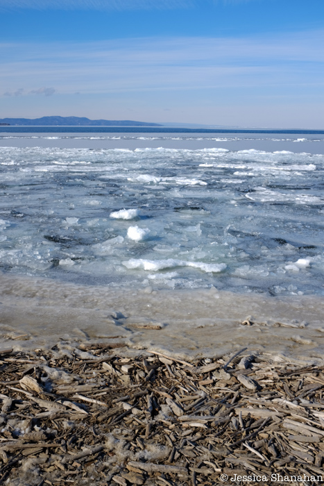
2.
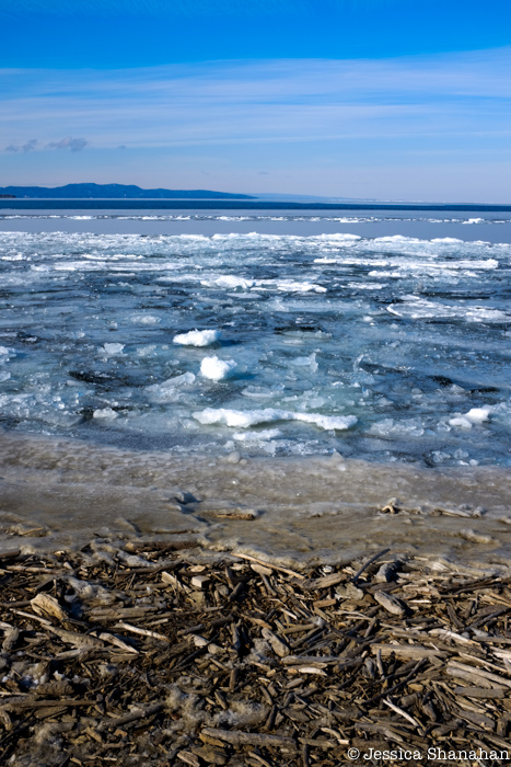


Which of the following do you prefer?
1.
2.
It would be easier to compare if they were side by side, but here goes… I like the foreground and midground of photo 2, and the sky and distant hills of photo 1. Why? The second one has lost the sense of distance imparted by the mistiness in the first — atmospheric distance. The sky color in photo 2 overpowers the lake without adding interest. It’s a little better if you crop off the top inch.
I think I could do that…
The top one looks colder. Brrr. The bottom one looks like it could be summer almost b/c of the super bright sunny sky, like Ma sez.
The second one is too blue, it does not look natural to me, I favor the first
I think the picture is most interesting as study of different hues of blue in nature. To me the wood at the bottom takes up too much space. It is a useful reference but I think about 1/2 as much of the vertical space for the wood may be better
It started out that way, and I took a bunch of photos where I was trying to get no wood at all, but then I got quite intrigued by the round warm brown-ness of the wood vs. the jagged coldness of the ice.