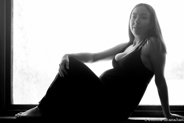
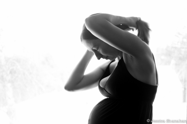
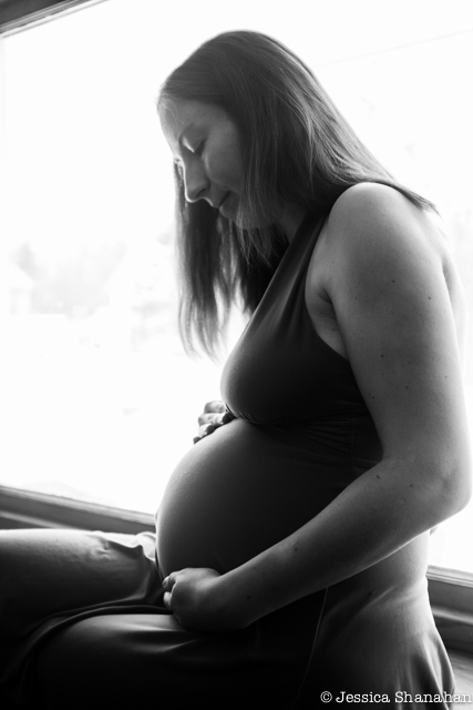
My lovely, patient model with the ever-growing belly has let me post some photos of her on my blog. I hope she doesn’t mind the quantity. I always think I learn a lot when looking at photographs I’ve taken, but it’s sure hard to implement this new knowledge. In all of these photos, the light is too harsh. Where indirect light falls (i.e.: on the feet, just under the window), the exposure is perfect. However, right in front of the window, the light is pretty harsh. It’s good for making silhouettes, but not so good for getting detail and good contrast. I’ve had these issues before. I need to use indirect light: window light, but keeping the window itself out of the photo. So, if I was going to have free-range at rearranging the Hack house, I would put the kitchen table in the living room and Heather sit on it. I would shoot so that the dark wall is in the background. The slightly-unsightly seam on that wall would not be so hard to remove.
See the perfect toes? The unfortunately grey face?
In real life, Heather’s face is at least as beautiful as her toes, depending on your preferences.
(I do like toes…)
& I think if the front leg was down, it would show off her belly better.

This one is my favorite of the bunch. I like the movement.

This is my favorite belly profile. The light is perfect, as is the belly-button, & I like the crossed legs.

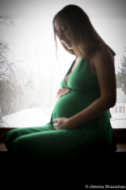
Then there’s this one, with the focus on the house in the background
and the limbs of the trees draping gracefully at the edge.
It’s what some would call “artsy” and others would call “out of focus.”
I like the story of momma+baby+house=home.


